What makes this a good painting?
by Dieter Michael Feurich
(#006)_A Painting speaks - Maurice de Vlaminck's "La Seine à Chatou"
A good painting speaks to us and demands a response from us. It is similar to when a person who, open-minded, curious, willing to share her thoughts and to get to know ours, asks us a smart question and looks at us bright-eyed, in expectation of a reply.
If we are open-minded and communicative ourselves, we will respond in a way that carries the exchange of thoughts forward. If we are not interested in the person or the subject matter, or if we feel that the person is not sincere but is merely talking without saying anything, we may keep our responses short so that no conversation ensues, or we just turn away.
When we stop at a particular painting in a museum or on an art website, it is usually because something was ‘said’ to us by that painting that arouses our interest, like we overheard a sentence in a conversation that somehow relates to our own experiences or opinions and we feel compelled to respond and share our view on the subject.
Whatever message we perceived from the painting (or print, sculpture, etc.) is visual in nature, no words. But for the power and relevance of the message that makes no difference. So, we will stop, look at the work closely (‘listen’ to it as it were), and we will relate the work to our very own collection of accumulated experiences.
We may make comparisons to what we have seen before elsewhere, we may be astounded by the new way the painting expresses something to us, or we may simply enjoy that the artist has ‘seen’ a subject matter in a way we have seen before so that the painting affirms our own ideas.
In this way, we will interact with the painting just as we would with a person in an interesting conversation in which we will also compare, be astounded, or simply enjoy. And, like in a conversation, we may see or ‘hear’ other things that we initially had not noticed and that deepen our relationship to the work, just like we deepen our involvement in a conversation as it goes on.
[ctd.]
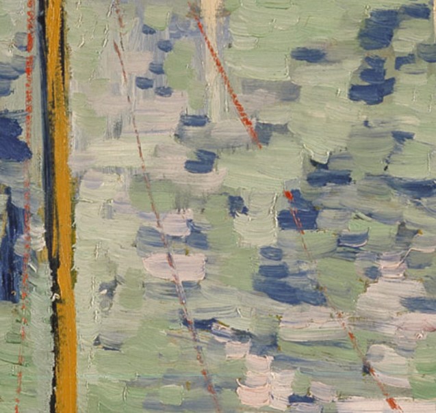
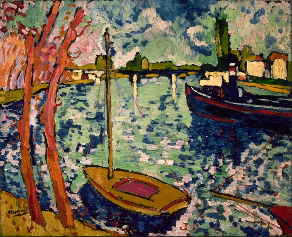
[Fig. 2] Maurice de Vlaminck | 1906 | La Seine à Chatou [Detail] | Oil on Canvas | Metropolitan Museum of Art, New York City
Maurice de Vlaminck’s La Seine à Chatou, 1906, [Fig.1] engages one in conversation. Anybody who has walked along a river or lake, who observed the water’s color, its rippled surface, and the boats, can relate to this painting. To stay in the above metaphor for a moment, if the painting were a person who wants to engage us in a conversation, the first sentence it may say or the first question it may ask us may be:
“Have you ever consciously experienced the open air above an expansive water surface like a river, have you smelled the water, felt the breeze, have you noticed the reflections in the water, have you followed the movements of the boats?”
And we may reply:
“Yes, I have, and now that you bring it up, the memory of this experience comes back to me. I enjoyed myself then and you have just revived the nice time I had. Thank you.”
And the painting (or de Vlaminck through his painting) may say:
You are welcome. I tried to capture such an experience in “Seine a’ Chatou”. Two aspects were important to me in getting my meaning across.
First, the composition: The main character of my painting, if you will, is the river itself. It takes up much of the canvas. The boats, trees, houses, the sky, and the bridge in the distance provide context but the focus is on the water.
Notice that you are looking almost down onto the water, rather than parallel to it. Your glance bounces from the water into the distance. Also notice how I framed the view with the trees on the left and the large boat on the right.
I see. I also notice that you used basically the same short brushstrokes throughout the painting regardless of whether you paint the rippled water in the foreground or the sky [Fig. 2].
Right. That’s because I care more about color and value and less about brushstrokes. I want the right paint in terms of color and value in approximately the right spot, and that is all it takes to convey a reality. The viewer will do the rest by drawing from his own experience: he already knows what clouds and water look like and therefore he only needs hints toward the reality I want to describe rather than the whole accurate reality as it was when I painted this.
You mentioned there were two aspects…?
Ah yes. We already mentioned it. The second aspect is simplicity. I omitted lots of detail, did not even try to capture the complexity of the waves or clouds.
My color choices were simple, too. I used a limited palette, only a couple of greens and blues (the same in the water and the sky), and a few warm colors.
Of course, I and the viewer know that nature’s palette is infinitely more varied but why try and capture what we cannot capture. I think that by simplifying the color scheme I am not taking anything away but I am enriching the viewers experience by engaging him in the making of the picture.
I am giving him only hints of form and color and I am asking him to do the rest, to complete the picture in his mind – it is almost like I am asking you to finish the painting in a way that is unique to you. Every viewer may finish it in a different, individual way.
[ctd.]
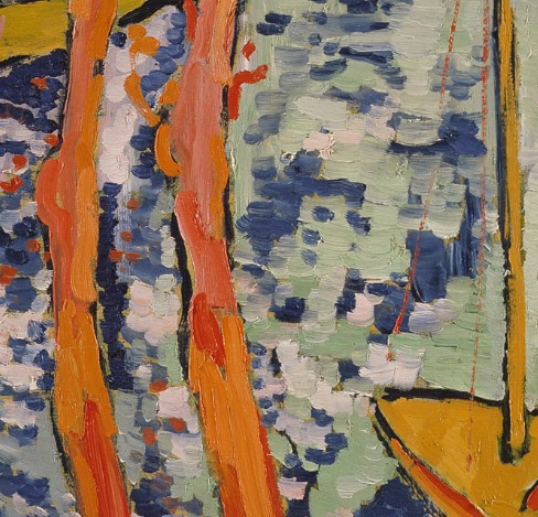
[Fig. 3] Maurice de Vlaminck | 1906 | La Seine à Chatou [Detail] | Oil on Canvas | Metropolitan Museum of Art, New York City
I see. So my part as the viewer is to relate you (the painting) to my experience which is unique to my person, and, therefore, the completed work will be unique to me, too.
Exactly.
I have a question: how did you select the colors? When you reduce the many colors of nature to just a few colors you must decide where to put which color. Do you go by value regardless of hue (meaning any color will do as long as the value is right), or do you place colors based on similarity to the natural hue?
For example, a brown (and the two trees on the left [Fig.3] may have been brown in reality) will be represented by an orange in the painting and not, say, by a blue which is on the opposite side of the color wheel although it may have the same value as the brown you want to represent.
Good question. You paint yourself?
Just a little.
It is both really. Value is always the most important thing. You want to get that right to make a painting understandable. But in the ‘Seine’ I also paid attention not to deviate too far from natural colors – even though the trees were not exactly as red as I am showing them.
I think your color choices are fantastic because they are simple but capture the scene so well: it appears to be a clear and windy early fall day, and one can almost smell the water. Composition and simplicity, I think those two painterly tools were put to excellent use here. Thanks for the chat. I must be going…
Alright then. Later.