What makes this a good painting?
by Dieter Michael Feurich
Thiago Boecan: EC20-F2
The heading of this post category “What makes this a good painting?” implies that EC20-F2 is a good painting although discussions of works of art should not start with such presuppositions.
Rather, we should ask first why we are talking about a particular work of art at all. Then we may want to try and explain the response the work triggered in our minds. This will not be objective as it will be in terms of our personal experience. Then we might ask for the underlying concept or idea of the work and whether this idea is being conveyed effectively. And we may then arrive at a somewhat better-informed opinion about the work which, however, is by no means the end of it: value judgements are not end products, they merely start a discussion.
I guess I chose this painting for this post because I enjoy looking at it; which means: it triggers thoughts in me that touch a range of my personal experiences, for example: the urban world I live in, colors as they appear to me in nature, various art movements and styles of the early 20th century, my natural preference for well thought-through color schemes and for pleasing proportions of shapes, and so on.
What are the painterly means used here and what is their purpose? Why did the artist make the choices he made? What might he tell us about it?
The painting is an arrangement of colored rectangles and squares. There is a subtle balance between a rather strict geometry (vertical and horizontal lines only) and an apparent randomness of the arrangement of rectangular shapes.
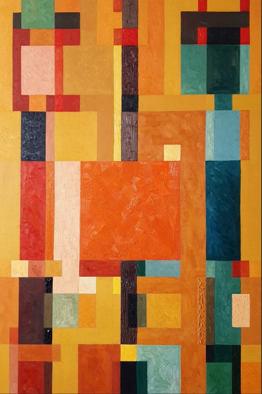
Essentially, three vertical discontinuous strips can be discerned, one in the center and one each to the left and right of it. The cool, dark color areas are concentrated mostly within those strips, whereas the warm, lighter color areas are mostly located in-between (intersecting the darker strips in many places).
The figurative basis for this work – if it has one at all – might be trees, possibly in the Fall or in evening or morning light; or it might have been an aerial view of buildings and streets. Or, it is simply an arrangement of shapes and colors unrelated to any specific figurative subject matter.
One significant element of the painting (at least it stands out to me) is the large orange square, centered on the vertical middle strip, and pushed down slightly such that its center is below the painting’s center.
This square seems to be the focal point, the anchor of the composition, despite its color and value being very much in line with the surrounding areas: It is simply the large size and the location that makes this square an important element in the painting, a point of rest, a stabilizing weight.
So what makes this painting good? Again, composition, color (hue, value, saturation), and line were used with a purpose: the painting has a warm, calming, satisfying effect while at the same time being interesting and engaging. It speaks to us and it challenges us to talk back – as a good painting should.
Other works by this artist are also great, by the way; check out, for instance, EC20-E1 (2020) or EC19-i3 (2019).