What makes this a good painting?
by Dieter Michael Feurich
Introductory Post
A good painting is good whether we particularly like it or not.
In fact, the expressions ‘I like‘ or worse ‘I love‘ should not be used at all when judging art. There is good work and not-so-good work. And there is poor work. We should aim to be able to tell which is which, not so much for the purpose of labeling artworks as good or bad or so-so, but rather to guide our discussions about artwork in an illuminating way.
Of course, there is the enjoyment of an artwork (or the lack thereof). This is, after all, one important reason people make art: for their and other people’s enjoyment.
And enjoyment does not necessarily mean the artwork gives us joy. In fact, the artwork may make us sad, thoughtful, frustrated, or angry. As long as it has an effect on us that goes beyond mere superficial ‘liking‘, the artwork is enjoyable.
Enjoying an artwork also involves, consciously or subconsciously, some thinking about why we enjoy it; there is an interaction happening between us and the artist, via the artwork. We are responding to an enjoyable artwork rather than putting a mental checkmark behind it (‘I like it, next.’)
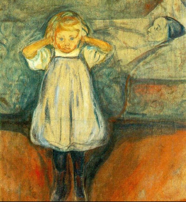
We may not ‘like‘ Edvard Munch’s Døden og barnet (Death and the Child) but it is certainly a good painting (I am referring to the version in the Kunsthalle Bremen). Its strong emotional subject matter and its heart-wrenching way of expressing it in the gesture and stare of the girl, make this a good painting by themselves.
However, the composition, the variation of color saturation and value, and the use of curved lines support and strengthen the intended expression. These painterly means have a purpose. This painting screams at us with a pain-filled voice and we are compelled to respond.
Munch painted another version of the same subject in the same year, located in the Munch-museet in Oslo, Norway.
I do not know if Munch painted other versions. I also do not know which one of the two paintings shown here was painted first. My assumption would be that the Oslo version was painted first. (If you, dear visitor, do know, please submit a comment in the contact page and I will update this post).
The reason for my assumption is that the Bremen version is so much more successful in conveying the underlying concept; a child’s inability to understand let alone to cope with the immeasurable pain of loss of her mother.
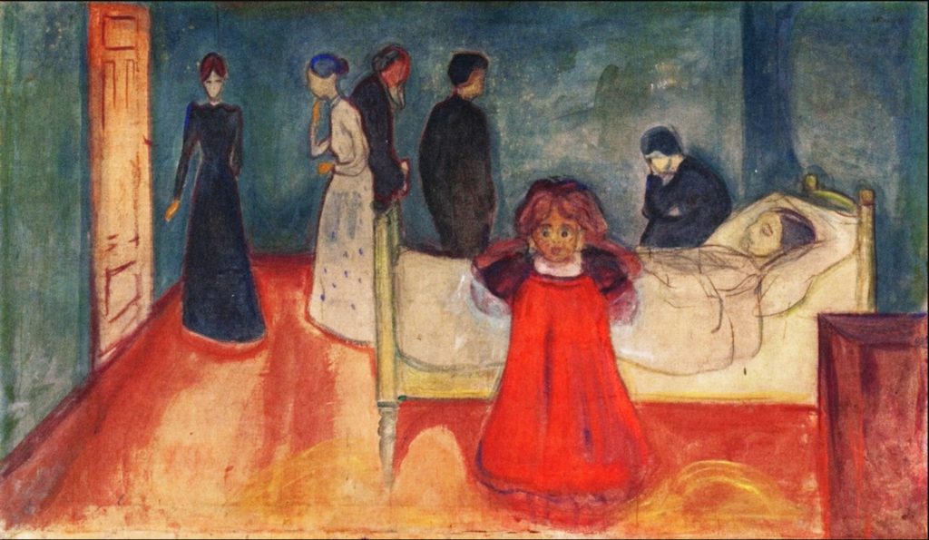
The Oslo version includes the grieving family in the background while attempting to focus the viewer’s attention on the child’s horror by various painterly means: the child stares right at us, the child’s gesture, the red dress, the disproportionate height of the child, the vaguely defined background figures, etc.
In the Bremen version, Munch seems to have tried – and successfully I think – to focus the viewer solely on the child’s experience. There is no grief here, the family has been cut out. There is no need to direct the viewer’s attention away from a background and towards the girl – because there is no background. There is only blatant shock and utter confusion. Grief requires an understanding of loss which the little girl does not have.
I believe there is another important difference between the Oslo and the Bremen versions. I could not find any references in literature addressing this item but to me it seems quite noticable. (And again, dear reader, if you know more than I, please submit a note in the contact page).
I believe that in the Bremen version, Munch reinforced the now-broken mother-child bond even more by remodeling the floor the child is standing on. In both versions, the girl is enclosed by curved, vibrating lines. In the Bremen version though, a female private anatomy seems to be indicated, partially hidden by the child’s legs. Munch may have given the girl a shorter dress for this purpose. The floor in the Bremen version was painted distinctly different from the Oslo version, with more detailed color and value gradations.
Maybe it was Munch’s intention to convey a message beyond the child’s shock over the death event: the event of the child’s birth is still within recent memory so that the connection between the child’s birth and the mother’s death is strong and direct.
Munch seems to emphasize that connection with direct painterly means: the S-shaped line that starts at the child’s left foot and continues up the side of the bed and the pillow to the mother’s head could be the direct visual expression of the connection between birth and death.